A book may not be judged solely by its cover, but let’s be honest, your cover is your first and most powerful marketing tool. In a world where readers scroll endlessly, and bookstores are visually saturated, an attention-grabbing book cover design can determine whether someone stops…or keeps scrolling.
Whether you're an author, publisher, or designer, this guide explores top book cover ideas, complete with current trends, psychology-backed principles, and keyword-rich insights to help your design truly stand out.
1. Bold Typography That Dominates the Design
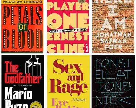
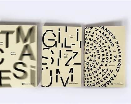
Big, confident typography is one of the strongest trends in modern book cover design. Letting the title or author name take center stage creates immediate impact, especially on small digital thumbnails.
Why it works:
- High readability
- Strong brand identity
- Perfect for thrillers, nonfiction, and contemporary fiction
Pro Tip: Use contrasting colors and clean sans-serif fonts to keep the typography crisp and eye-catching.
2. Minimalist Magic with Negative Space

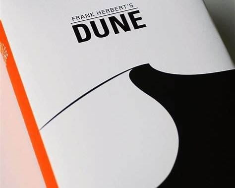
Minimalist covers continue to dominate bestseller lists because they deliver clarity and sophistication.
Why it works:
- Calms the eye
- Highlights a single symbolic element
- Communicates genre quickly
Minimalism is especially effective in self-help, business, and literary fiction, immediate where the message is more important than visual chaos.
3. Illustrated Covers With Character Personality
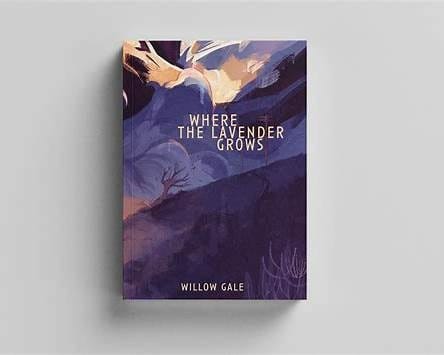

Illustration brings warmth, humor, and personality, making it an ideal choice for romance, YA, fantasy, and children’s books.
Why it works:
- Memorable and unique artwork
- Trendy "TikTok-friendly" aesthetic
- Emotional connection with characters or themes
Hand-drawn, watercolor, and digital art styles are all trending this year.
4. Moody Photography for Emotional Depth
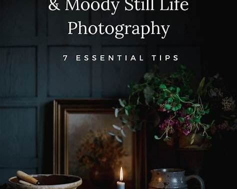
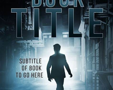
Photography-driven covers can deliver instant atmosphere, mystery, romance, nostalgia, or suspense.
Why it works:
- Real-world visual cues
- Strong emotional storytelling
- Works well for thrillers, memoirs, and historical fiction
Choosing the right color tone, cool blues, warm sepia, or high-contrast shadows, can shift the entire mood of your story.
5. Symbolic Icons for Genre Clarity


A single symbolic element (a key, a crown, a flower, a broken glass) can hold powerful meaning and instantly attract the right readers.
Why it works:
- Clean and memorable
- Helps communicate the theme
- Works across genres, especially mystery, historical, fantasy, and nonfiction
Keeping the symbol simple ensures it remains iconic even in thumbnail size.
6. High-Contrast Color Palettes That Pop
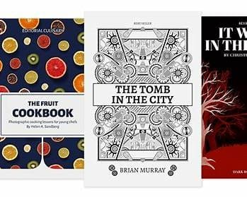
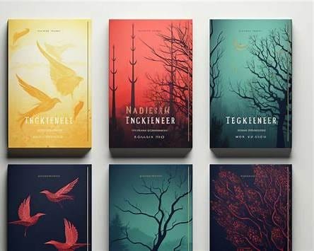
Color psychology plays a huge role in attention-grabbing book cover design. Bold palettes like yellow + black, red + white, or neon gradients can instantly catch the eye.
Why it works:
- Stands out on crowded platforms
- Conveys energy and tone
- Creates strong brand recognition
Bright palettes work especially well for genres targeting younger or digital-first audiences.
7. Vintage & Retro Aesthetics for Nostalgic Appeal
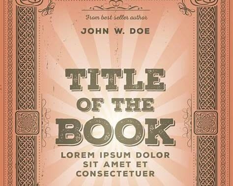
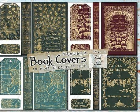
Retro-inspired covers, such as classic 70s typography, grainy textures, or Art Deco motifs, tap into the current nostalgia trend.
Why it works:
- Emotionally resonant
- Unique visual identity
- Perfect for memoirs, literary fiction, and historical narratives
A slight grain or muted palette adds authenticity and charm.
Final Thoughts
Your book cover isn’t just artwork; it’s a marketing strategy. The right combination of typography, imagery, color, and minimalism can elevate your brand, attract your ideal audience, and increase sales. Whether you choose a bold typographic layout or an emotional photographic design, your cover should reflect your story’s heart while standing out in a visually noisy world.
✨ Ready to Create a Stunning Cover That Sells?
Turn your ideas into an unforgettable visual identity. Supercharge your book’s first impression with Wunderkint, your creative partner for standout, scroll-stopping designs.
👉 Start your next cover with Wunderkint ;today!
